A Canva ease of use review should start with a real deadline, not a feature list. Someone preparing slides, promoting an event, or making a social post needs a design that is clear.
Templates, a drag-and-drop editor, and ready-made assets lower the barrier, but that convenience can encourage rushed choices.
This guide shows where Canva feels approachable, which habits improve results, and when specialist software may be wiser.
Start With One Clear Job
A blank canvas is intimidating when the project has no defined reader or purpose.
Begin with a format people recognize: a poster, product announcement, presentation, résumé, menu, or video cover. That narrows templates and gives each element a role.
A charity flyer needs a date, location, and next step; a product post needs a benefit and visual proof. A clear brief makes design choices easier before colors or effects enter the screen.
Use Templates as a Starting Point
A template supplies size, layout, and visual rhythm, helping a beginner move beyond a blank page.
It should fit the actual job, not whatever looks fashionable in search results. A restaurant menu template may not suit a research presentation, and a playful social layout can weaken a serious announcement.
Replace default text and irrelevant images, then ask what readers must notice first. The goal is useful structure, not borrowed personality.
Simple Choices Beat Fancy Effects
New designers often improve a page by removing rather than adding. Use two fonts, keep a small color palette, and give repeated headings the same treatment.
If the page feels crowded, reduce decorative icons before shrinking text. A community event graphic is easier to scan when title, date, and location have room to breathe.
These are simple design habits, but they build visual consistency without professional training.
Why the Editor Feels Forgiving
Canva’s editor is built around familiar actions: click, drag, resize, duplicate, group, and undo.
Alignment guides and grids help first-time users keep images and text from drifting apart, while the canvas gives immediate feedback.
That suits everyday materials with short turnaround times. Yet a tidy page can still be hard to read if every item has equal emphasis. Use alignment tools to support clear hierarchy, not to decide what matters.
Learn One Repeatable Format First
A beginner does not need a large library of pages, folders, and templates in the first week. Pick one repeated task, such as social posts, lesson slides, proposals, or internal announcements, and make several versions.
The first attempt may be slow; the second reveals what you can reuse, and the third shows which elements create mistakes.
This repetition develops practical confidence faster than exploring every feature. It reveals whether Canva fits the work you need to publish.
Learn When a File Raises a Question
Canva’s Design School offers tutorials and courses on layout, color, typography, and tool use.
They work best when you use them to answer a question from a real file, such as why a slide looks crowded or a title does not stand out.
Watching tutorials before making anything can feel productive without building judgment. Learn one principle, apply it, and compare the result. That turns guided learning into visible improvement.
Pay Only to Fix Repeated Friction
The free version can handle routine designs, including posts, presentations, basic visual documents, and starter assets.
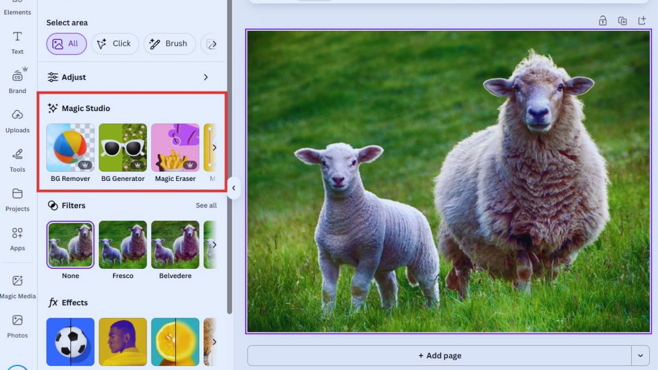
A paid plan may be worth considering when premium content, background removal, resize tools, brand controls, or storage solve a weekly problem.
A small seller producing product images may benefit from background removal, while a marketing team may need a shared Brand Kit more than extra effects.
Check current availability because plan access and workspace settings affect which tools a person sees.
Brand Kits Need Rules Behind Them
A logo folder is not a brand system. For repeat work, document colors, type choices, image style, and fixed wording, then make the approved version easy to find.
Canva’s Brand Kit can keep visual assets together, while reusable templates reduce rushed off-brand edits.
It works best for teams making similar materials often, not for a one-time poster. The payoff is fewer approval loops and more consistent output.
Use AI for Ideas, Not Final Decisions
AI tools can create a background, adjust an image, suggest copy, or generate variations from a rough concept.
They cannot decide whether a claim is accurate, an image suits the audience, or a design resembles another brand too closely.
Review generated text for missing details and images for distorted hands, unreadable lettering, misleading product details, or awkward cultural signals.
Treat AI as a drafting aid rather than an authority on taste or truth.
Bring In Specialist Tools for Precision
Canva is intentionally lighter than professional photo, illustration, video, and layout software.
It can suit everyday marketing, classroom work, simple internal documents, and fast social assets, but detailed retouching, vector-path editing, advanced motion, dense audio work, and controlled print production may require another program.
This is not a failure of the platform. It is a boundary that keeps common tasks fast while leaving specialist control to tools designed for it.
Set Boundaries for Mobile, Offline, and Sharing
Mobile is useful for a quick text change, comment, approval, or small social graphic. It is less comfortable for detailed decks or crowded layouts where the screen hides spacing.
Canva also offers offline editing, but test your device and project before depending on it during travel or a live event.
For teams, assign one owner, use comments for feedback, and name final exports clearly. These habits reduce version confusion and protect last-minute changes.
Also Read: Semrush Pricing Review: Is the Cost Justified?
Test Canva Through a Normal Week
Do not decide from a glossy template gallery. During five normal days, create one asset, adapt it to another size, invite feedback, export it, and reopen it later to make a correction.
Notice whether the message remains clear, the file is easy to locate, and the layout can be updated without rebuilding everything.
These trial questions keep the test tied to actual use:
- Can you make the main message easy to scan?
- Can another person update the correct version?
- Does the template save time without looking generic?
Make Each Version Better
Canva is beginner-friendly because it removes many technical barriers from recurring design tasks.
It does not remove the need to decide what people should notice, which information is essential, or when a template no longer fits the message.
Begin with one real format, keep your choices simple, and ask someone from the intended audience what they understood in three seconds. Over time, repeated practice turns easy software into clearer, more intentional communication for real audiences.